
TADJE ORTHOPEDICS
Streamlining Surgery Care
As the UX & UI designer of the app, aimed at streamlining surgery care, both pre-operation and post-operation, my approach involved meticulous planning and consideration of user needs. The primary goal was to ensure that patients were well-informed about what to expect throughout their surgical journey. By sending the app directly to their emails, we aimed to eliminate the risk of physical packets being damaged, lost, or destroyed and inundating the call center with questions about upcoming surgeries. This digital solution not only provided a more secure method of information delivery but also granted clients easy access to the app regardless of their internet connectivity. The layout and design of the app were crafted with a user-friendly interface, allowing patients to navigate effortlessly and access all necessary information at their fingertips. Through this streamlined approach, we aimed to enhance the overall patient experience and empower individuals with the knowledge they need for a successful surgical outcome

Type:
UX/UI (app design)
Deliverables:
• Lo-Fi & Hi-Fi Prototype
• Design System
• Accessibility
• User Research
• Icon Creation
• UI Design/layout

Focusing on User Care & Experience
To better understand Tadje Orthopedics, I researched their target demographic, creating user personas and other medical apps within the market.
I conducted interviews with more than 6 people and also design empathy maps to know more about their user frustrations and what would be beneficial to have. Keeping in mind the demographic seemed to be in the range of older users (55+) getting surgery or younger users (18-30) with sports injuries. I had to make this easy to use for older users while also making it appealing and intuitive for younger users.
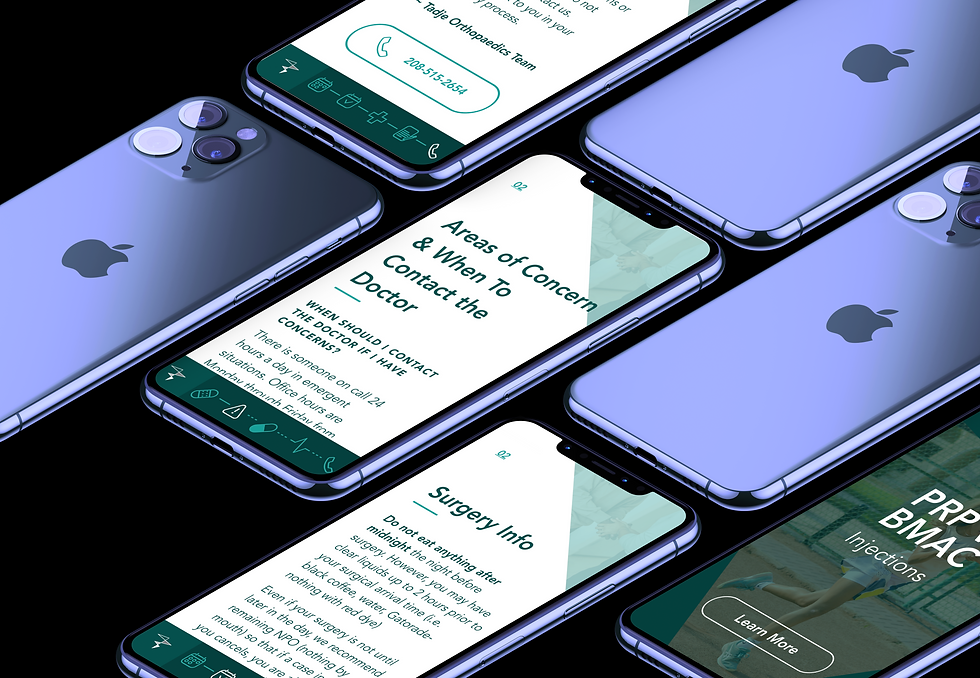
The main problem which most users had in common was a lack of resources and information in one spot. Most users were given several packets of what to do and expect before surgery, another for what the surgery would entail and lastly post care. Most users would lose the packets, they would lose one or they would sustain damage. Then the calls would flood their font desk and thus ensuing a game of phone tag of figuring out where to get all the information. Points that were worth noting of what users wanted and came to the conclusion of:
-
All the information in one place where it can be easily accessed
-
A call button for easy call access or questions even after reading the information provided
-
Easy to read, can be followed easily, high contrast for easy viewing
-
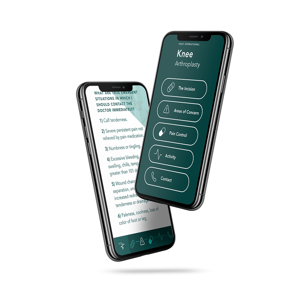
Clear icons and pictures to help demonstrate key points

User Age Range
18-85
Any user receiving surgical care pre & post-op.
Call Button
Call button was requested by Tadje and it's users so users can feel comfortable calling. The goal was not to get rid of all calls, but to reduce unneeded calls.
High Contrast & Visual Weight
Larger text, high contrast and clear visuals were key for this demographic. This ensured an enjoyable user experience for all.
User Care
wanted to make it as minimal as possible so the user wouldn't get confused or flustered. Putting Users and their experience first.
The Ideation Process


Setting Goals & Workshop Solutions
My goal was to create a visually appealing and easy to use app. One of the biggest issues in creating the app ironically enough was the large paragraphs of information. I didn't want users to feel as if they were just scrolling through large paragraphs of text. After breaking up all the information into pre-op, surgery information, post-op and long term, was breaking down the larger portions of information. Which we did with titles, dividers and visuals. It made the larger paragraphs easier to digest and not as monotonous.
After creating the UI design layout and mock ups, it was prototyped to see how intuitive and if the visual weight and look would work for what our vision was for the app. After some UX reiterations, several UI re-designs and button redesigns. I felt comfortable with my choices and we pitched the prototype to Tadje.
Mock ups, Prototyping & Solution
In the end the app was an overall success and cut down front desk calls by 78%. People were commenting how easy it was to also share their surgery information with loved ones who would care for them. As well as being easy to read, follow and access.
Final Product
Once the user needs were determined and after addressing the problem with the current packets, I was able to create an experience map to map out the users journey through what would be the new app and create a map following the users footsteps.
Addressing User Needs/Problems
Personas, User flow & Accessibility
Once persons were created and the accessibility issues were discussed, such as not everyone having access to wi-fi, especially older generations, larger text, high contrast, a call button, visual demonstrations and icons for markers. I also wanted to add a bit of visual flair for younger users. Clean, modern and easy to use.
User Sitemap

Sketching & Wireframing


Mockups & Final Design
Result is an aesthetically pleasing Micro-app that is easy to follow, filed with useful information instead of the jargon the packets offered, shareable without wifi and step by step instruction on each phase of the process.


App Highlights and Features
User friendly design
Call button with easy access
Rid of paper packets
No wifi needed and easy to share
User Solutions
Color contrast and hierarchy for easier reading and skimming. A large target size for buttons ensures that users are able to activate them. As well as clear diagrams and icons for users.